You’ve probably seen those weekly grocery store newspaper ads featuring “fresh” salsa that looks brown, “succulent” oranges that look yellow, and “tasty” burgers that look green.
Does the look of these ads motivate you to grab your keys, drive to the store, and buy the products? Probably not.
Bad design and low-cost print aren’t very enticing to a consumer. While you don’t have to break the bank on your food product labels, it is imperative they have eye-catching shelf appeal and consistent color. They also have to meet retailers’ packaging requirements.
How do you print a great food label that attracts consumers and keeps your retailers happy?
Follow these three food label printing tips and you can’t go wrong:
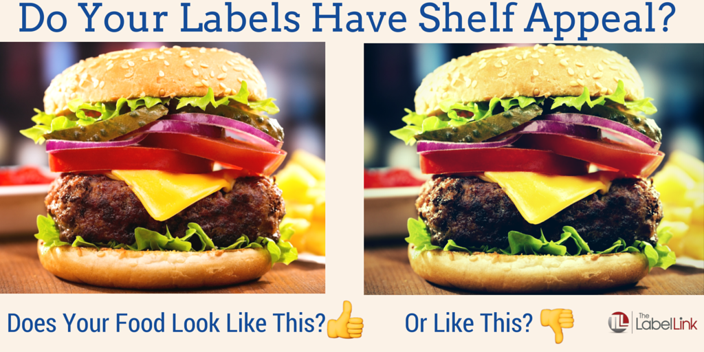
Tip 1: Give Your Labels Some Shelf Appeal
This is often the first thing clients ask us about, and it should be. If your products don’t stand out on the shelves, they won’t sell. How do you make them irresistible to consumers and retailers?
- Colors must be consistent and vibrant, from lot to lot.
- Label image(s) must look authentic (Hint, the key is in the consistency of print & the systems that ensure that.)
Tip 2: Meet Retailer Packaging Guidelines
Food labels are unique in several ways:
- They often have several versions of the same product so SKU management is critical
- Being a perishable product, the shelf life is short. Most labels require a “Best By:” area of secondary print which, in many cases, requires special coatings or materials to accept the lot codes properly. Also, the label lead times are critical.
- They often require special materials for special conditions like varying temperatures and moisture exposure. And if they come near or directly in contact with food, special adhesives are needed.
- Clear labels or not. More companies are leaning toward clear labeling for a “no label” look, opting for a “fresh” appeal. But you have to use the right inks when printing a label like this or the color of your contents may change the color of your ink.
- Properly marked Nutrition Facts & UPCs. Most retailers & the FDA will have a set of guidelines for nutrition facts labeling requirements. They recently changed
- Many Retailers require a prototype label that looks close or identical to the actual production label. That’s when a digitally printed label works well. We offer both digital, one-off labels that look and feel similar to the production label with a high-quality print on the exact adhesive label. With digital, the print can be as little as one of each version, back-to-back. And, because there are no plates, costs remain low. Most consumers choose this option. However, if you need an identical print, we offer press proofs, meaning the proofs utilize the actual printing plates and materials on the exact production press (usually a flexographic press).
- Proper marking requirements. This includes UPCs with proof of readability of a grade C or higher. Also, labels should be marked in a way for lot and batch controls which are a measure of FDA compliance. Speaking of FDA compliance, if a food product is labeled (think apples or bananas), FDA materials must be used for direct or indirect food contact.
Tip 3: Ensure Product Labels Ship On Time
It’s imperative that product labels ship on time for these reasons:
- The product is perishable.
- Many retailers have a chargeback if the finished goods are not delivered on time.
- To avoid an application or fill line shut down because you had a label stock out, or because the delivery was late. We’ve helped clients with customized programs to develop processes that ensure your inventories are sufficient so you can deliver on-time to your clients.
Here are just a few suggestions that we, at The LabelLink, practice & offer to clients facing these requirements:
- Ensure your printer uses an objective, quantifiable way to measure color. Matching color by eye is subjective (not to mention will vary depending upon the light source) and should never be the sole determinant. We use Delta E readings in combination with the Pantone Matching System book to verify spot colors and we produce matchprint proofs calibrated to the press to ensure color consistency.
- Does your printer consistently measure their on-time delivery? Late orders can cost money by shutting down a line or even worse, by causing a missed delivery to your retailer. We generally see a range of 95 – 99.5% on time delivery.
- Does your printer work with you to ensure quick turnaround? Most labels can be ready in a 2-3 week turnaround. But if you need it sooner, your printer should be flexible enough to accommodate the occasional rush request. Or they may need to set up a special system for continuous quick turn needs.
I have noticed in myself, that sometimes I don’t trust a label that is too different. How do you suggest finding a balance between standing out and scaring people away like this? I appreciate all your information on the regular packaging guidelines and how to ensure that you are following them accordingly. Thank you!
Hello Brooke,
That is a good question. The key is to work with a printer who has color process standards for consistency. It should not just be a quick view check and densitometer reading, but rather a full-color, calibration between press to monitor; a system of matching to the Matchprint and not just the previous run samples; and of course, your review (via a press check) to ensure that the color matches the target under standardized lighting.
I’m glad to be of help!
Thank you for your comment.
Rosalyn
The colors of an advertisement can make all the difference. I think that has a lot to do with how the printer prints the picture. I did not know that low quality prints would make customers less likely to buy a product.
I think that tip about shelf appeal is really important. Personally, it’s easier to try new products when the label is aesthetically pleasing. It’s kind of amazing how the label of a product can influence if people buy it or not.